


































Sidebar
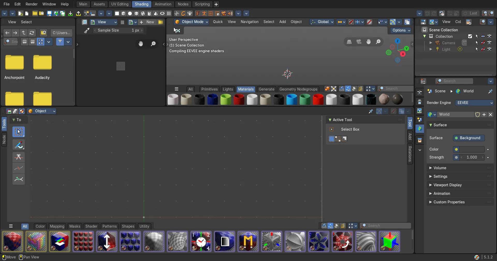
The Geometry Node Editor is made of several areas.
Introduction
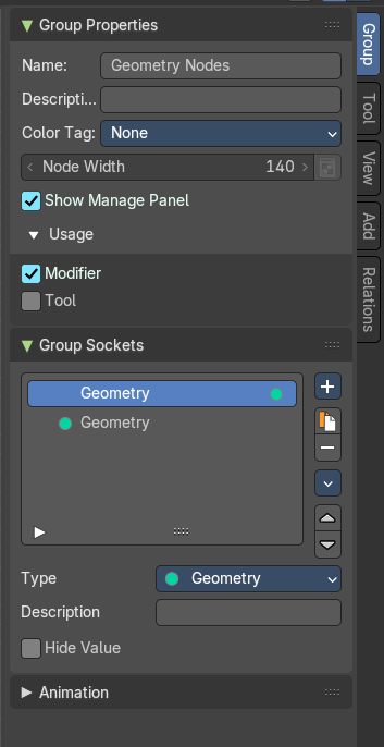
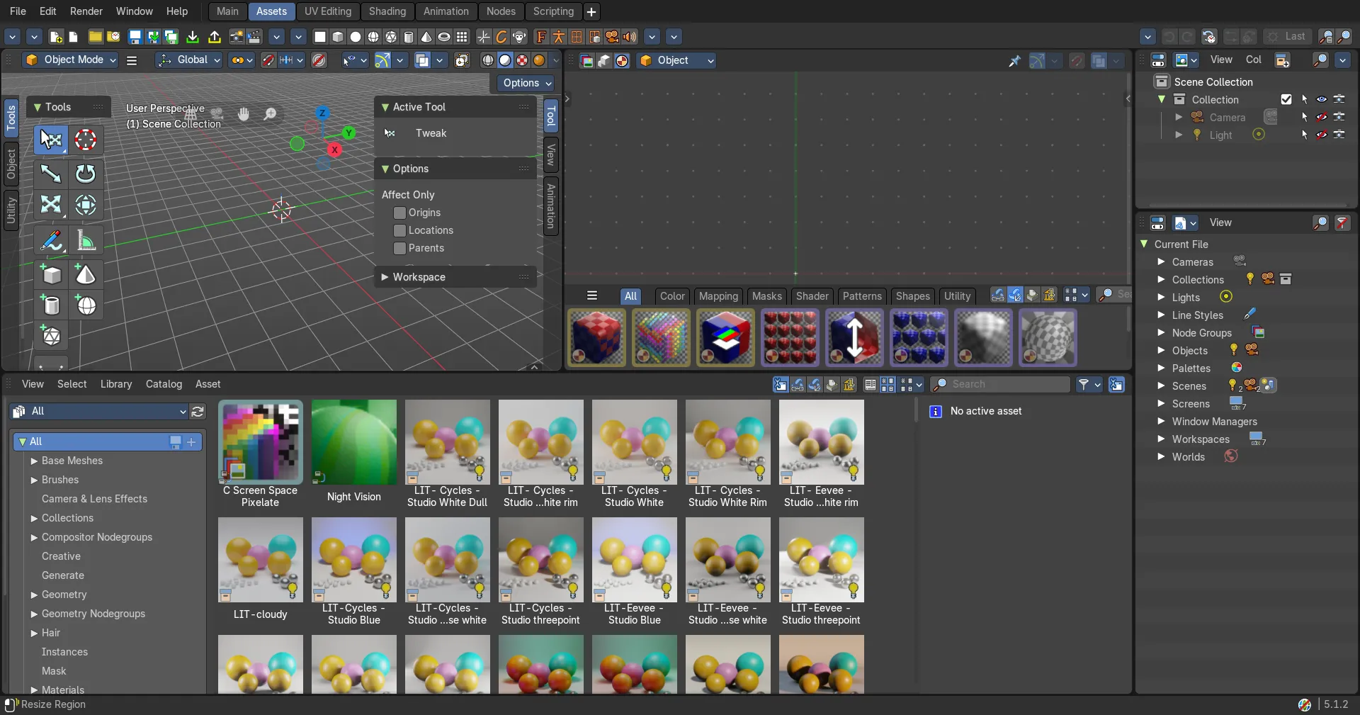
The Geometry Node Editor is made of several areas. At the right side you will find the sidebar. Here you will find further options and settings for the Geometry Node Editor nodes and its tools.
Right Click menus
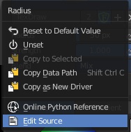
You will open the usual right click menus when clicking with the right mouse at elements in the sidebar. Its content is in big parts self explaining.
The right click menus are explained in the chapter 6 Editors Introduction.
Group Tab
Group tab - Introduction
The Shader sidebar Group tab at the right side contains options and settings for node groups and socket input and output properties.
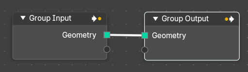
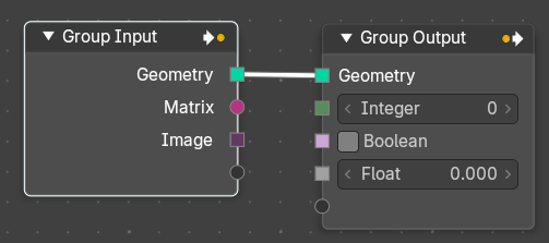
It is especially meant for the group nodes. Grpup Input and Group Output.
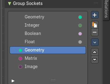
In the group sockets panel you can define what sockets the Group Input and Group Output node has.
Group Properties Panel
Name
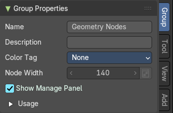
Change the name of the current node group. Type in a new name and hit enter.
Description
Change the description of the current node group. Type in a new name and hit
enter.
Color Tag
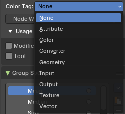
Changes the header color of the current node group.
| Entry | What it does |
|---|---|
| Node Width | The width for newly created node groups. Value can range between 40 and 700 px. · Set default group node width: Sets the width based of the parent node group in the current context. |
| Show Manage Panel | Display the manage panel when creating a modifier. |
| Usage subpanel | Modifier: The node group is used as a geometry modifier. This setting is only relevant for marked nodegroups as an asset. · Tool: The node group is used as a tool. This setting is only relevant for marked nodegroups as an asset. |
Group Sockets Panel
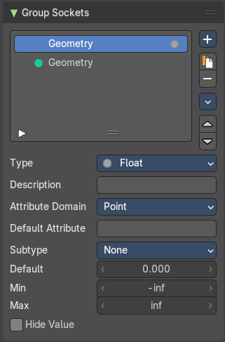
Manage the input and output properties of the Group Input and Output nodes.
More than one input and output slot can be useful when you want to modify the shader in the node group in more than one way.
Group Socket List
List of available input and output sockets.
Note: The list can be sorted by dragging the items around. And you can rename them.
List
The list of input and output sockets.
Name
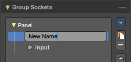
Change the name of the current selected input socket by double clicking on the socket in the list. Type in a new name and hit enter.
New Item
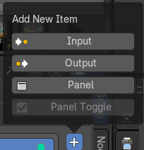
Adds a new input sockets to the list.
| Entry | What it does |
|---|---|
| Input | Adds a new input sockets to the list. |
| Output | Adds a new output socket to the list. |
| Panel | Adds a new panel socket to the list. |
Panel Toggle
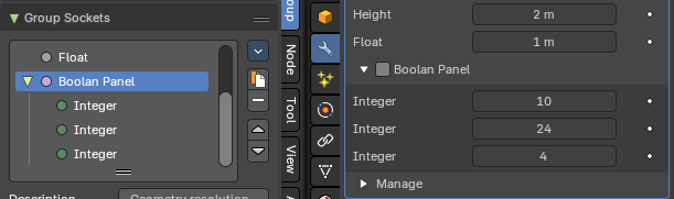
Converts an active selected Boolean socket into a Panel Boolean.
When converting a boolean to a panel boolean, the parent panel of the Boolean socket will move to the panel header.
Panel Toggle subpanel
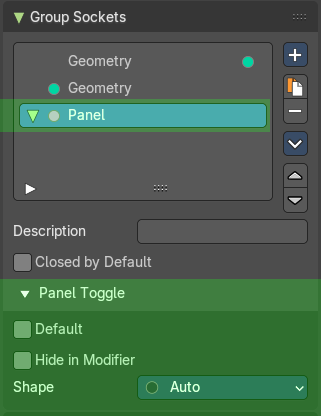
When adding a panel toggle to a panel then a subpanel appears.
| Entry | What it does |
|---|---|
| Default | Input value used for unconnected sockets. |
| Hide in Modifier | Don’t show the input value in the geometry nodes modifier interface. |
Shape
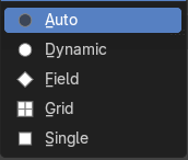
What kind of higher order types are expected to flow through this socket.
| Entry | What it does |
|---|---|
 Duplicate Item | Duplicates the active socket. |
 Remove Item | Removes the selected input socket from the list. Node tree interface specials |
Move Item Up/Down

Moves the active item to the specified direction. You can move the active item up or down the list.
Note: You can also alternatively drag and drop the active item to re-order.
Inputs
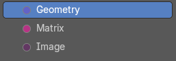
Inputs are characterized by the colored dot to the left. These are manifested in the Group Input node.
Outputs
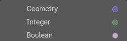
Outputs are characterized by the colored dot to the right. These are manifested in the Group Output node.
Group Sockets Panel
The group input sockets differs in functionality from the group outputs sockets. So you will get other content when you selct a group input node compared to the group output node.
Type
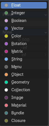
What kind of node group input or output type it is.
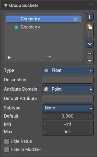
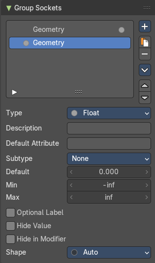
Type Float
Description
Add a tooltip to the socket description.
Atrribute Domain
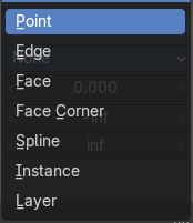
The attribute domain used by the geometry nodes modifier to create an attribute output.
Default Attribute
The default attribute.
Subtype
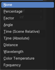
Subtype of the default value.
| Entry | What it does |
|---|---|
| Default | The default value for the socket. |
| Min | The minimum value for the socket. Note: This is only available for vector and float types. |
| Max | The maximum value for the socket. Note: This is only available for vector and float types. |
| Optional label | Hide the label if not needed. |
| Hide Value | Hide the input value even when the socket is not connected. |
| Hide in Modifier | Don’t show the value in the geometry nodes modifier interface. |
Shape
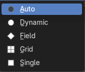
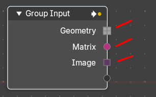
The shape of the socket.
Type Integer
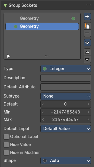
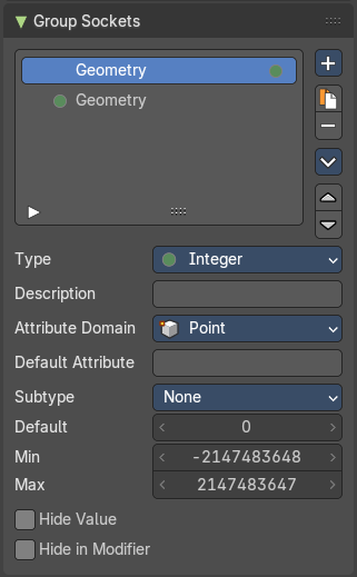
Description
Add a tooltip to the socket description.
Atrribute Domain
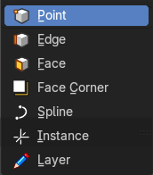
The attribute domain used by the geometry nodes modifier to create an attribute output.
Default Attribute
The default attribute.
Subtype
Subtype of the default value.
| Entry | What it does |
|---|---|
| Default | The default value for the socket. |
| Min | The minimum value for the socket. Note: This is only available for vector and float types. |
| Max | The maximum value for the socket. Note: This is only available for vector and float types. |
Default Input
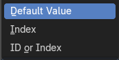
Input to use when the socket is unconnected.
| Entry | What it does |
|---|---|
| Optional label | Hide the label if not needed. |
| Hide Value | Hide the input value even when the socket is not connected. |
| Hide in Modifier | Don’t show the value in the geometry nodes modifier interface. |
Shape
The shape of the socket.
Type Boolean
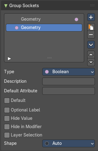
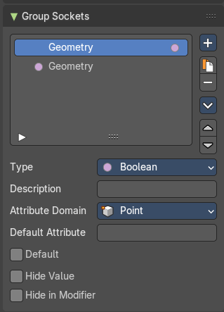
Description
Add a tooltip to the socket description.
Atrribute Domain
The attribute domain used by the geometry nodes modifier to create an attribute output.
| Entry | What it does |
|---|---|
| Default Attribute | The default attribute that is used by a geometry nodes modifier. |
| Default | The default value for the socket. |
| Optional Label | Make the label optional. This may resul tin the label being skipped in some cases. |
| Hide Value | Hide the input value even when the socket is not connected. |
| Hide in Modifier | Don’t show the value in the geometry nodes modifier interface. |
| Layer Selection | Take grease pencil or layer group as selection field. |
Shape
The shape of the socket.
Type Vector
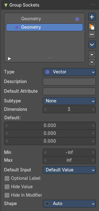
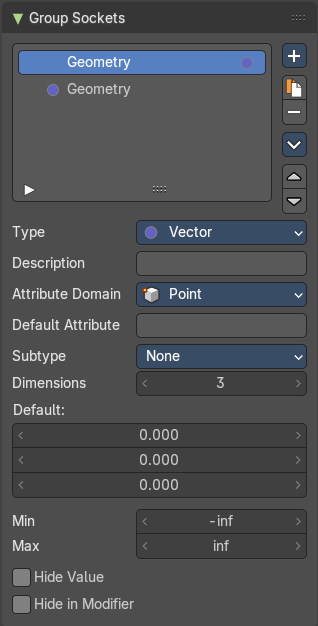
Description
Add a tooltip to the socket description.
Atrribute Domain
The attribute domain used by the geometry nodes modifier to create an attribute output.
Default Attribute
The default attribute that is used by a geometry nodes modifier.
Subtype
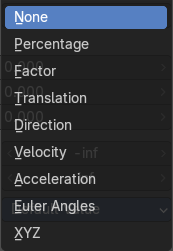
What special math operation is required. The subtype menu allows you to define the socket type sliders and read-out.
| Entry | What it does |
|---|---|
| Dimensions | How much dimensions to calculate. |
| Default | The default vector. It changes, dependant of what dimensions you use. |
| Min / Max | Minimum value and maximum value. |
Default Input
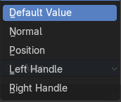
Input to use when the socket is unconnected.
| Entry | What it does |
|---|---|
| Optional Label | Make the label optional. This may resul tin the label being skipped in some cases. |
| Hide Value | Hide the input value even when the socket is not connected. |
| Hide in Modifier | Don’t show the value in the geometry nodes modifier interface. |
Shape
The shape of the socket.
Type Color
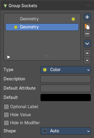
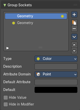
Description
Add a tooltip to the socket description.
Atrribute Domain
The attribute domain used by the geometry nodes modifier to create an attribute output.
| Entry | What it does |
|---|---|
| Default Attribute | The default attribute that is used by a geometry nodes modifier. |
| Default | The default color for the socket. |
| Optional Label | Make the label optional. This may resul tin the label being skipped in some cases. |
| Hide Value | Hide the input value even when the socket is not connected. |
| Hide in Modifier | Don’t show the value in the geometry nodes modifier interface. |
Shape
The shape of the socket.
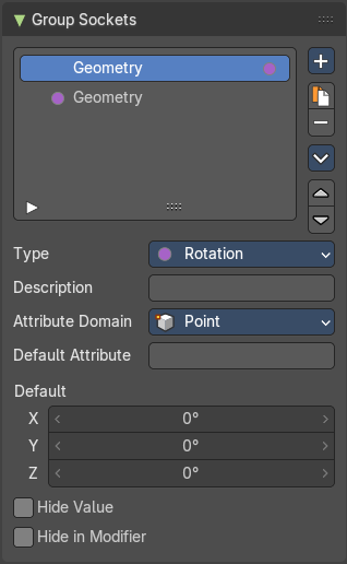
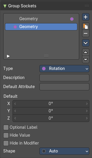
Type Rotation
Description
Add a tooltip to the socket description.
Atrribute Domain
The attribute domain used by the geometry nodes modifier to create an attribute output.
| Entry | What it does |
|---|---|
| Default Attribute | The default attribute that is used by a geometry nodes modifier. |
| Default | The default rotation values |
| Optional Label | Make the label optional. This may resul tin the label being skipped in some cases. |
| Hide Value | Hide the input value even when the socket is not connected. |
| Hide in Modifier | Don’t show the value in the geometry nodes modifier interface. |
Shape
The shape of the socket.
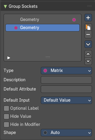
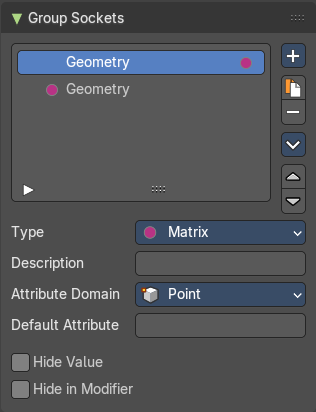
Type Matrix
Description
Add a tooltip to the socket description.
Atrribute Domain
The attribute domain used by the geometry nodes modifier to create an attribute output.
Default Attribute
The default attribute that is used by a geometry nodes modifier.
Default Input
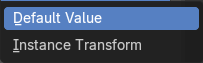
Input to use when the socket is unconnected.
| Entry | What it does |
|---|---|
| Optional Label | Make the label optional. This may resul tin the label being skipped in some cases. |
| Hide Value | Hide the input value even when the socket is not connected. |
| Hide in Modifier | Don’t show the value in the geometry nodes modifier interface. |
Shape
The shape of the socket.
Type String
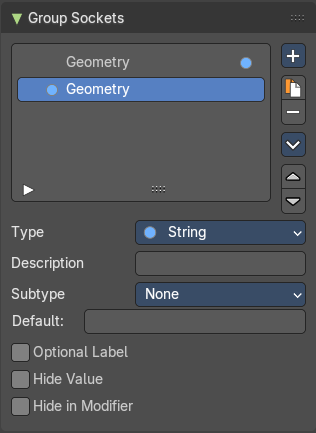
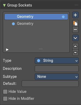
Description
Add a tooltip to the socket description.
Subtype
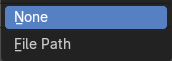
What special math operation is required. The subtype menu allows you to define the socket type sliders and read-out.
| Entry | What it does |
|---|---|
| Default | The default string. |
| Optional Label | Make the label optional. This may resul tin the label being skipped in some cases. |
| Hide Value | Hide the input value even when the socket is not connected. |
| Hide in Modifier | Don’t show the value in the geometry nodes modifier interface. |
Type Menu
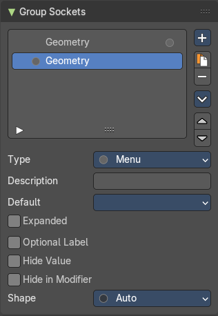
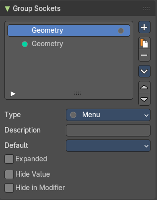
| Entry | What it does |
|---|---|
| Description | Add a tooltip to the socket description. |
| Default | The default menu. |
| Expanded | Draw the menu socket as an expanded drop down menu. |
| Optional Label | Make the label optional. This may resul tin the label being skipped in some cases. |
| Hide Value | Hide the input value even when the socket is not connected. |
| Hide in Modifier | Don’t show the value in the geometry nodes modifier interface. |
Shape
The shape of the socket.
Type Geometry
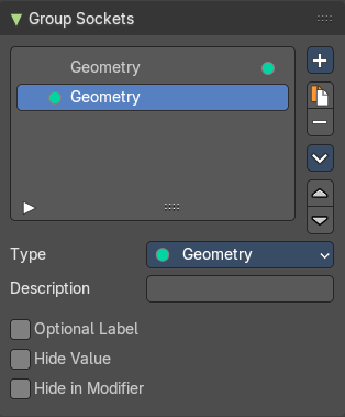
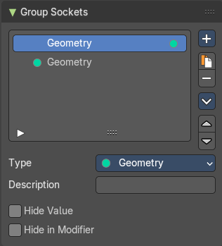
| Entry | What it does |
|---|---|
| Description | Add a tooltip to the socket description. |
| Optional Label | Make the label optional. This may resul tin the label being skipped in some cases. |
| Hide Value | Hide the input value even when the socket is not connected. |
| Hide in Modifier | Don’t show the value in the geometry nodes modifier interface. |
Type Object
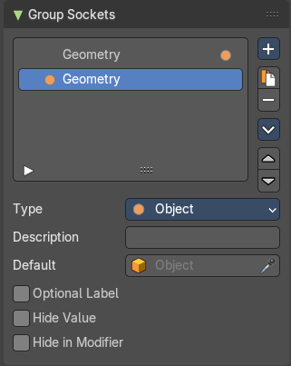
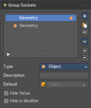
| Entry | What it does |
|---|---|
| Description | Add a tooltip to the socket description. |
| Default | The default object. |
| Optional Label | Make the label optional. This may resul tin the label being skipped in some cases. |
| Hide Value | Hide the input value even when the socket is not connected. |
| Hide in Modifier | Don’t show the value in the geometry nodes modifier interface. |
Type Collection
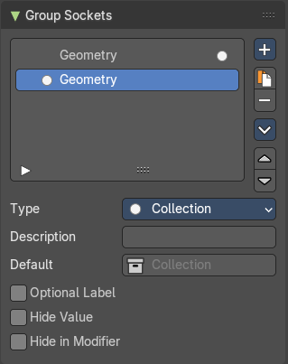
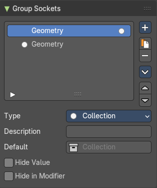
| Entry | What it does |
|---|---|
| Description | Add a tooltip to the socket description. |
| Default | The default collection. |
| Optional Label | Make the label optional. This may resul tin the label being skipped in some cases. |
| Hide Value | Hide the input value even when the socket is not connected. |
| Hide in Modifier | Don’t show the value in the geometry nodes modifier interface. |
Type Image
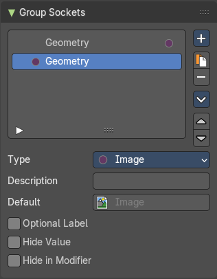
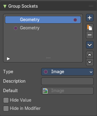
| Entry | What it does |
|---|---|
| Description | Add a tooltip to the socket description. |
| Default | The default image. |
| Optional Label | Make the label optional. This may resul tin the label being skipped in some cases. |
| Hide Value | Hide the input value even when the socket is not connected. |
| Hide in Modifier | Don’t show the value in the geometry nodes modifier interface. |
Type Material
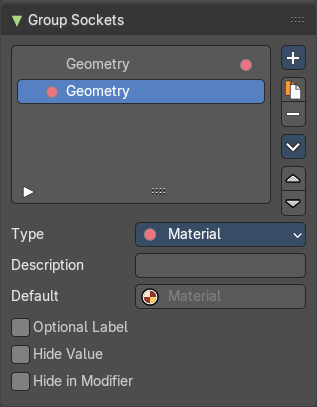
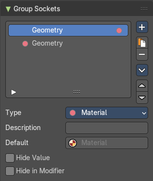
| Entry | What it does |
|---|---|
| Description | Add a tooltip to the socket description. |
| Default | The default image. |
| Optional Label | Make the label optional. This may resul tin the label being skipped in some cases. |
| Hide Value | Hide the input value even when the socket is not connected. |
| Hide in Modifier | Don’t show the value in the geometry nodes modifier interface. |
Type Font
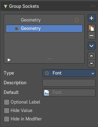
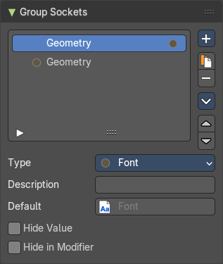
| Entry | What it does |
|---|---|
| Description | Add a tooltip to the socket description. |
| Default | The default font. |
| Optional Label | Make the label optional. This may resul tin the label being skipped in some cases. |
| Hide Value | Hide the input value even when the socket is not connected. |
| Hide in Modifier | Don’t show the value in the geometry nodes modifier interface. |
Type Bundle
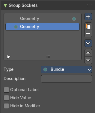
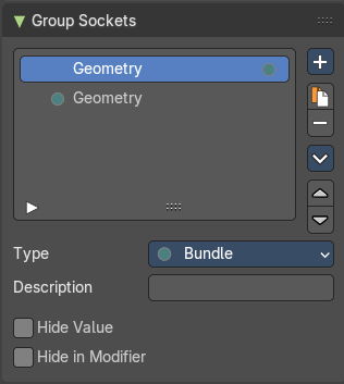
| Entry | What it does |
|---|---|
| Description | Add a tooltip to the socket description. |
| Optional Label | Make the label optional. This may resul tin the label being skipped in some cases. |
| Hide Value | Hide the input value even when the socket is not connected. |
| Hide in Modifier | Don’t show the value in the geometry nodes modifier interface. |
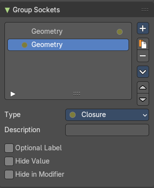
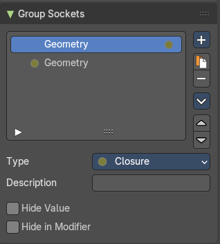
Type Closure
| Entry | What it does |
|---|---|
| Description | Add a tooltip to the socket description. |
| Optional Label | Make the label optional. This may resul tin the label being skipped in some cases. |
| Hide Value | Hide the input value even when the socket is not connected. |
| Hide in Modifier | Don’t show the value in the geometry nodes modifier interface. |
Group Sockets Panel - Type Panel
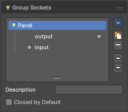
TODO
Closed by default
Panel is closed by default on new nodes.
Panel Toggle
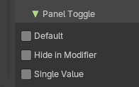
Note: The Panel Toggle properties are only for the Panel Boolean type of panels.
| Entry | What it does |
|---|---|
| Default | The default value for the boolean toggles. |
| Hide in Modifier | Hides the panel boolean toggle from the modifier stack. |
| Single Value | The default value for the panel boolean toggle. |
Animation Panel
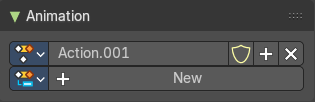
Animation panels are about the Animation Slots for scene wide animation clips.
| Entry | What it does |
|---|---|
| New | Create a new action clip for the light, used in the Dopesheet Editor - Action Clip mode. |
| Action Selector | This selector allows users to manage actions associated with a particle system, ensuring that the correct animation data is applied. · Fake User: Assigns a "fake user" to the action, preventing it from being automatically deleted when it is no longer in use. · Add: Make a copy of the current action, including all animation data. · Remove: Delete the selected action, removing it from the light source. |
Node Tab
Node panel
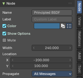
Name
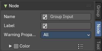
The name of the selected node. Read only.
Despite being read only, this text can be edited. But be careful, it will not change the name in the header of the node. And it does not snap back to the original name of the node when you remove the custom text.
Label
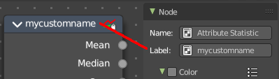
Allows you to define a custom name for the selected node. This text does change the name in the header of the node.
Width and Location
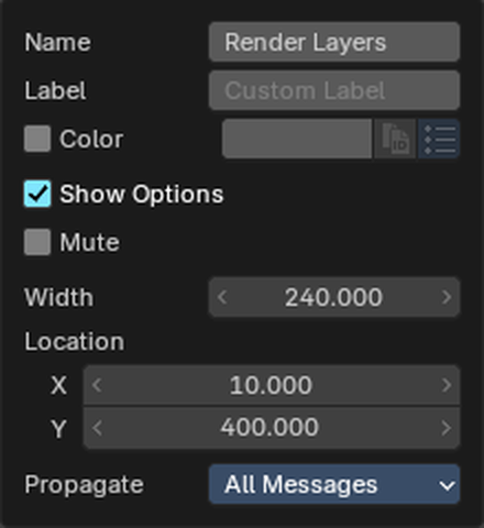
Type exact numbers to size and place the selected node. Handy for keeping big node trees tidy and lined up.
| Entry | What it does |
|---|---|
| Width | How wide the node is. Same as dragging its side edge. |
| Location | Where the node sits in the editor, as X (left/right) and Y (up/down). Nodes inside a frame still use the position in the whole editor. |
Warning Propagation
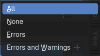
What kind of messages should be propagated from this node to the parent node.
Color
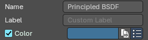
Give the node a color of its own, so parts of a big node tree are easy to tell apart. Tick Color and click the color field to pick one.
The two small buttons next to the color field help when you color many nodes.
Copy Color
Gives all selected nodes the same color as the active node. Select the nodes, make the one with the color you want active, then click the copy button.
Presets
Stores colors you like, so you can reuse them with one click. Presets are saved globally, so they work in your other files too.
Properties panel
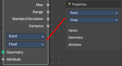
Lists the properties of the node in editable form. And the inputs in text form.
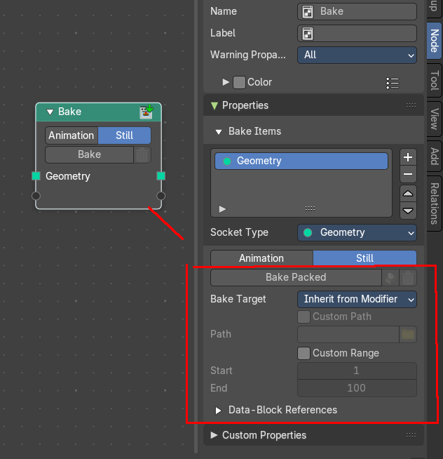
Note that some nodes might not have all functionality in the node itself, but shows it in the properties panel instead. The bake node for example, shows the bake packed content just in the sidebar.
To keep the information together, we describe this functionality in the corresponding node chapters.
For the group input and group output options see chapter Group properties.
Tool Tab
Tool Tab
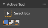
Contains the settings of the currently active tool in the tool shelf.
In the node editor we don't have something special here. The tool related settings are explained in the tool shelf chapter.
View Tab
View Tab - Annotation Panel
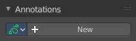
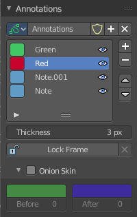
View related settings. Which is in the node editor just the Annotations panel where you can manage the Annotation layers and materials.
When you don't have drawn an annotation yet then the panel just contains a New button.
Annotations prop
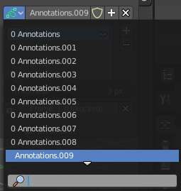
Add, remove and rename new annotations.
Drop down box
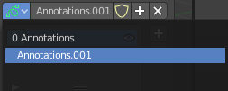
A list of the available annotation layers.
| Entry | What it does |
|---|---|
| Edit Box | The name of the current annotation. You can rename the annotation to your needs here. |
| Fake User | Assign a fake user to this annotation. Fake users is an odd concept to keep data in the scene even if it has no user somewhere. The fake user is then a dummy user so that the object is not deleted when saving the scene. |
| Add Annotation | Add a new annotation. |
| Delete Annotation | Delete the annotation. |
List of Annotation Strokes

Here you see your Annotation layers for the current Annotation. Every layer can have an own color.
At the right side you find buttons to sort them and to add and remove new Annotation layers.
You can change the color by clicking at the color field. A color dialog will pop up. You can rename annotation layers by double clicking at it.
The eye icon allows you to make it invisible And it has a search field.
| Entry | What it does |
|---|---|
| Thickness | The thickness of the annotation stroke. |
| Frame Locked/Unlocked | Lock frame displayed by current layer. This toggles whether the active layer is the only one that can be edited. |
Onion Skin
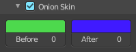
Enable Onion Skinning.
Onion Skinning allows to show ghosts of the keyframes before and after the current frame. In this sub panel you can adjust the color of the onion skin frames.
With the numbers below the colors you can define how many frames before or after are displayed that way.
Add
Add Tab
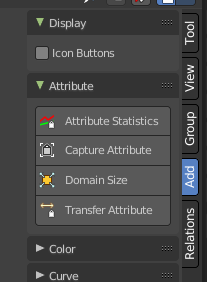
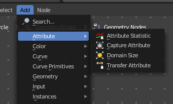
Here you can find the same nodes than in the Add menu. Panels are more convenient to use. They stay open for example. It's your decision with what system you want to work.
We won't explain the content of the panels again. The single nodes are explained in the add menu chapter.
Usage
Click at one of the node buttons, then move the mouse into the viewport. The created node sticks at the mouse. Click again to release it.
Add tab - Display Panel
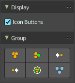
Icon Buttons
You can display the nodes in the panels either as text buttons or as pure icon buttons.
Relations Tab
Relations tab - Display Panel
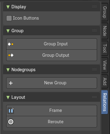
Icon Buttons
You can display the nodes in the panels either as text buttons or as pure icon buttons.
Relations tab - Group Panel
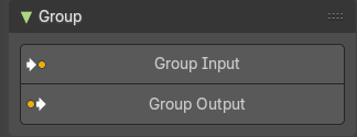
Group Input
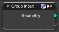
Adds a group input node.
Group Output
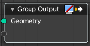
Adds a group output node.
Relations tab - Nodegroups Panel
When you create a node group, then this node group is listed here. And can be dragged from there for reuse too.
Relations tab - Layout Panel
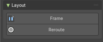
These nodes helps organizing the node layout.
Frame
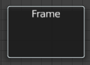
The Frame node allows you to drop nodes into a frame. This frame can be dragged around as a whole.
Adding and Removing Nodes
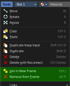
Nodes can be added by simply dropping them onto the frame. Or with the Join in New Frame menu item in the Node menu.
To remove a node from the frame use Remove from Frame.
Resizing Frame
When the Frame node is first placed in the node editor workspace you can resize it by dragging one of the edges.
Once a node is placed in the Frame, the Frame shrinks around the nodes. You cannot resize it anymore with handlers. Just by dragging around the nodes inside of the frame.
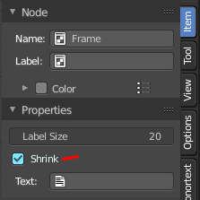
This behavior can be changed by disabling the Shrink option in the Item tab in the Properties panel. Then you can resize the frame again by dragging the edges.
Label and Color
You can change the name of a frame in the Node panel. And you can give it a custom color by checking the Color checkbox and adjusting the color then.
Reroute
Adds a reroute point that can be used to reroute connections. It allows just one input, but allows multiple output connections.
To quickly add a Reroute node into an existing connection, hold Shift and Right Mouse and drag the mouse to cut through the link. A new reroute node will be added.
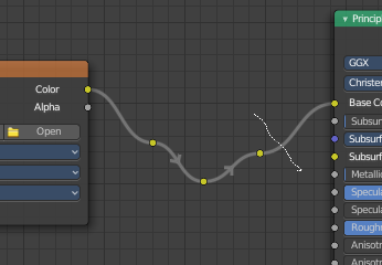
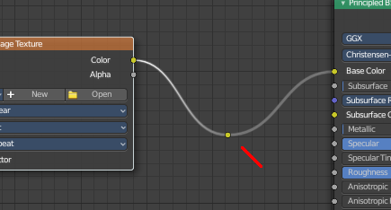
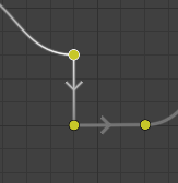
When you exceed a specific angle amount between the reroute nodes, then the node connection becomes a sharp corner, and not longer a Bezier like soft curve.
Move, Rotate, Scale
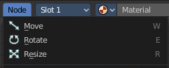
A normal node has a handler. The reroute dot not. You can't simply move it around with the mouse by clicking at the top area. It has none. You have to use the move, rotate and scale commands. They can be found in the View menu.