



































Sidebar
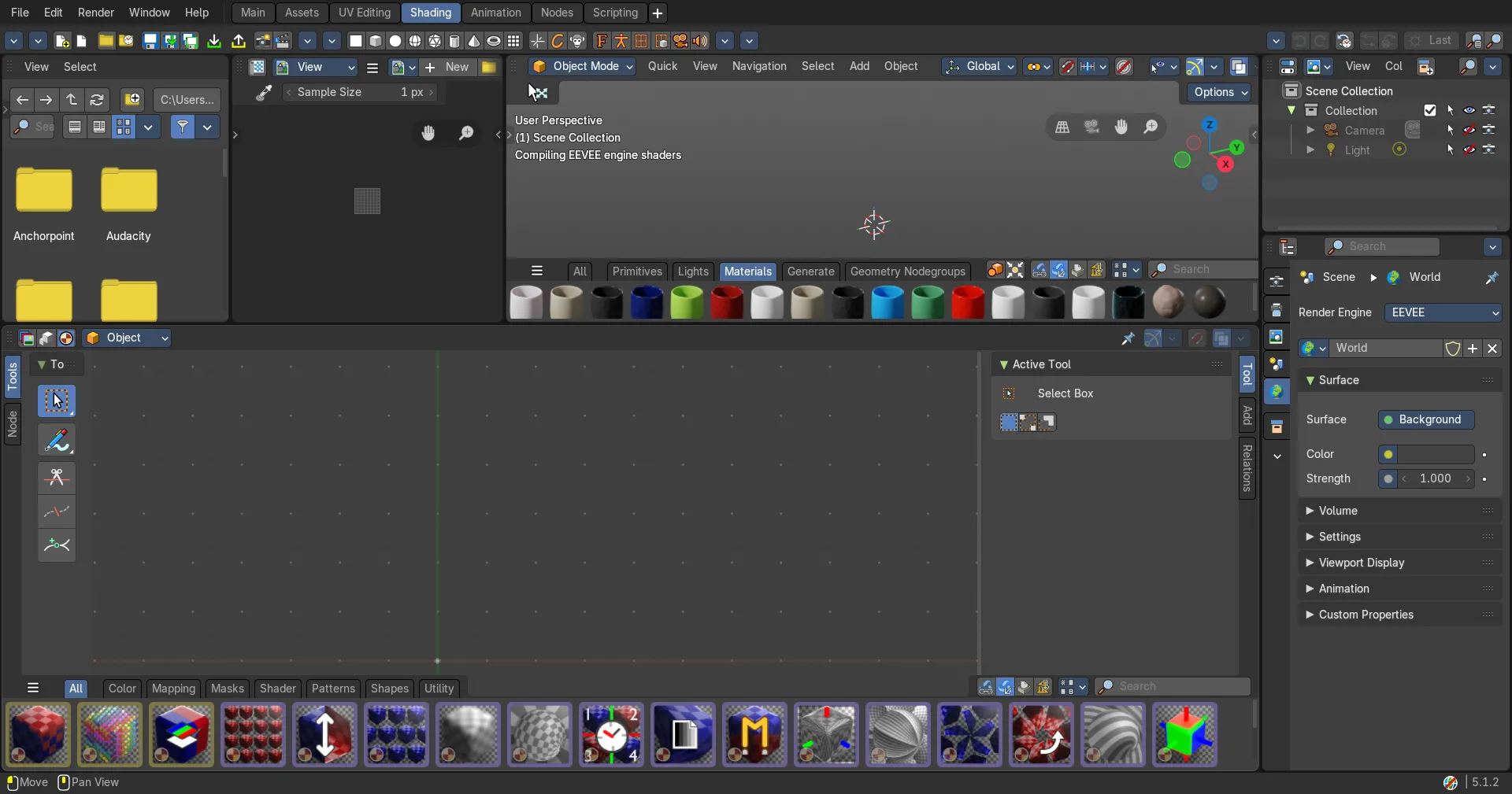
The Compositor Editor is made of several areas.
Introduction
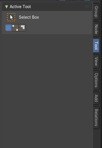
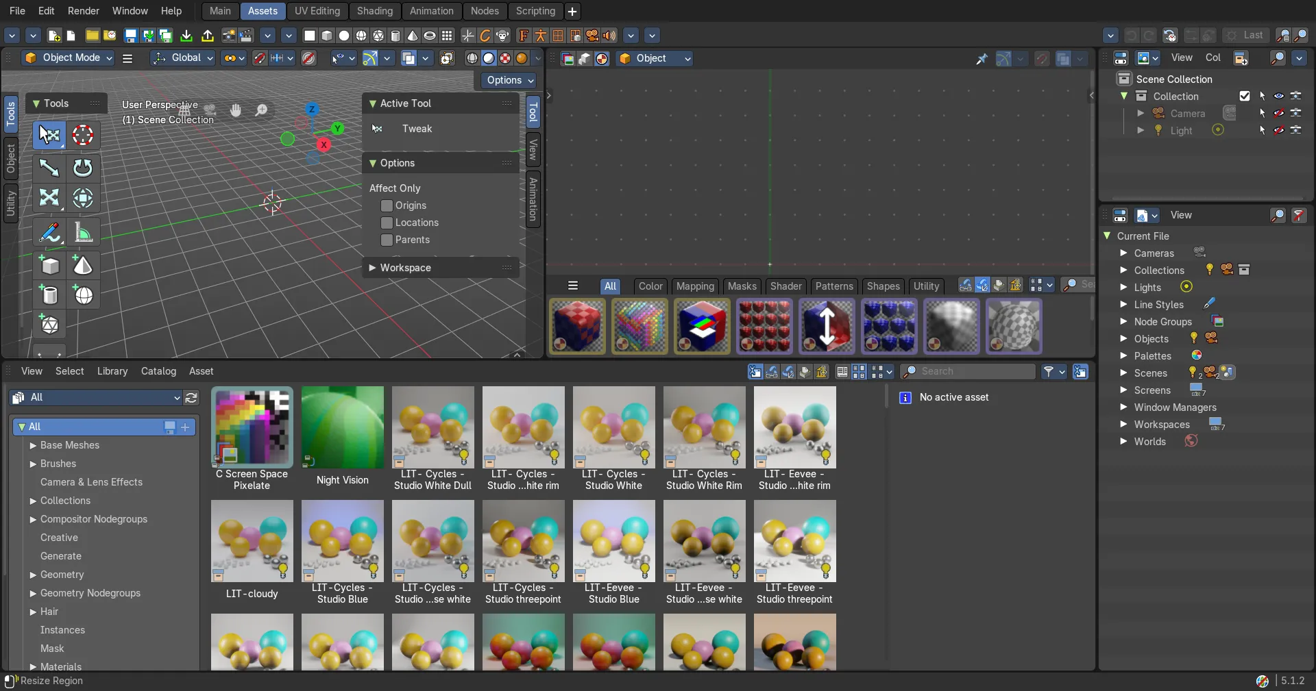
The Compositor Editor is made of several areas. At the right side you will find the sidebar. Here you will find further options and settings for the Shader Editor nodes and its tools.
Right Click menus
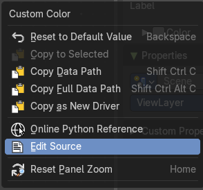
You will open the usual right click menus when clicking with the right mouse at elements in the sidebar. Its content is in big parts self explaining.
The right click menus are explained in the chapter 6 Editors Introduction.
Node Tab
Node Tab - Node Panel
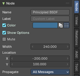
The node panel allows you to give nodes and node groups a name and a label, and change its color.
Name
The type of the node.
Label
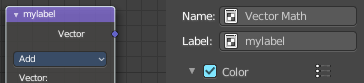
The label name of the node.
Color
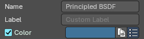
Give the node a color of its own, so parts of a big node tree are easy to tell apart. Tick Color and click the color field to pick one.
The two small buttons next to the color field help when you color many nodes.
Copy Color
Gives all selected nodes the same color as the active node. Select the nodes, make the one with the color you want active, then click the copy button.
Presets
Stores colors you like, so you can reuse them with one click. Presets are saved globally, so they work in your other files too.
NodeTab - Properties Panel
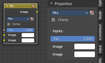
This panel shows usually the same properties than the properties at the node. These properties are already explained in the Add menu chapters. So we won't repeat them here.
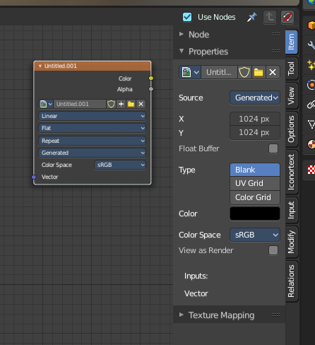
But there are exceptions like the Image node. Here the Properties panel shows much more options than at the node. It shows all the possible image settings. We will explain the extra options here.
Node Tab - Properties Panel with Image node
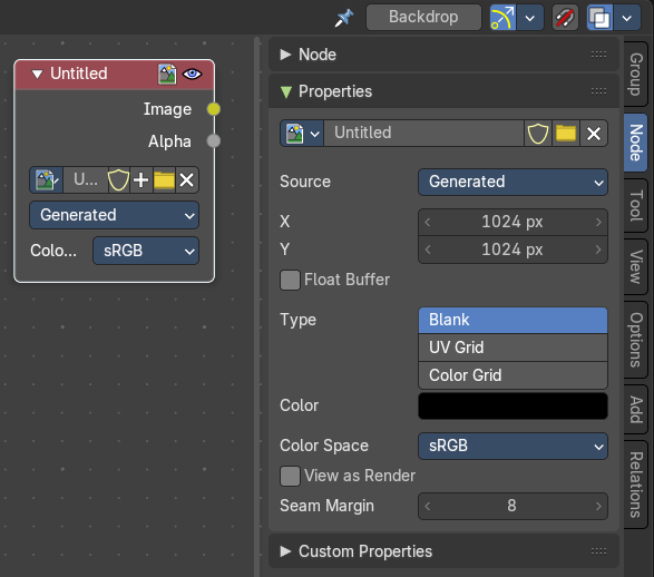
Contains image related settings. Size, type, and so on.
Image Property
Load an image and / or switch to other images.
From left to right ...
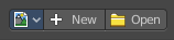
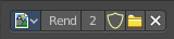
| Entry | What it does |
|---|---|
| Image Browser | This is a list of the images in the scene. Allows you to switch to other images. |
| New / Open | When nothing is loaded then you will see the New / Open buttons to load a new image, or to create a new one. |
| Image Edit Box | The name of the currently selected image. And you can rename the image here too. |
| Fake User | Wit this button you assign a fake user to this selected image. Data, like images, that is not longer linked to anything else gets removed when you save and reload a scene. Bforartists has the concept of fake users to go around this behavior. An image with a fake user is in fact linked to something. And so it is not lost when you save and reload the scene. |
| Open Image | Load an image |
| Remove | Delete the image. |
Source
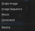
Choose the image type. This type gets usually automatically set. When you create a new image, then this image is generated. When you load an image then the Source switches to Single Image.
Generated images does not have a path.
Source Type Single Image
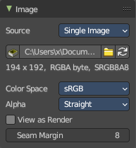
Path edit box

| Entry | What it does |
|---|---|
| Pack | With this button you can pack the movie or the image sequence into the blend file. It gets packed when you save the blend file the next time. |
| Path edit box | See and edit the path to your movie or image sequence files. |
| Open | Open a new movie or image sequence files. A file dialog will appear. |
| Refresh | Reread the movie or image sequence files. |
Color Space
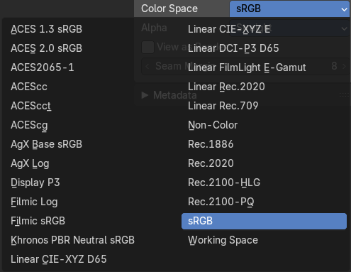
The color space for the image.
Alpha
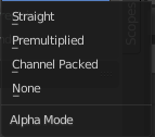
How to calculate the alpha channel.
Half Float Precision
Just with image material that uses 32 bit float. Use just 16 Bit per channel instead of the full 32 bit. This lowers the memory usage while rendering.
View as Render
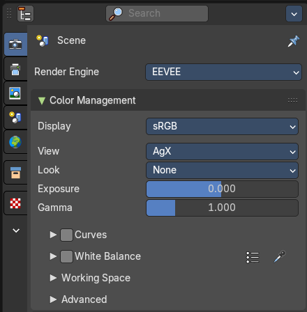
Display the image with using the color management settings. The color management can be adjusted in the properties editor in the Render tab.
Seam Margin
This option belongs to the UV Editor, and has no effect in the Image editor. Take a margin into account when fixing UV seams during painting.
Source Type Movie + Image Sequence
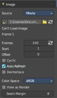
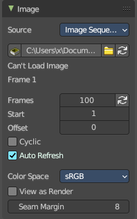
Path edit box

| Entry | What it does |
|---|---|
| Pack | With this button you can pack the movie or the image sequence into the blend file. It gets packed when you save the blend file the next time. |
| Path edit box | See and edit the path to your movie or image sequence files. |
| Open | Open a new movie or image sequence files. A file dialog will appear. |
| Refresh | Reread the movie or image sequence files. |
| Entry | What it does |
|---|---|
| Info string | Some information about the currently loaded movie. Frames, resolution and color space. |
| Frames | The number of frames of the movie or image sequence. · Match Movie Length: Set Users Image Length to the one of this video. |
| Start | The start frame of the movie or image sequence |
| Offset | Offset the number of the frame to use in the animation. -1 means off. |
| Cyclic | Cycle the images in the movie. |
| Auto Refresh | Always refresh image on frame changes. |
| Deinterlace | Deinterlace the movie file on load. |
Color Space
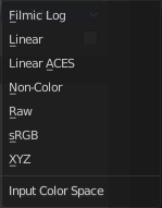
Choose the color space type for the movie or image sequence files.
Alpha
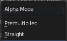
Choose the alpha channel mode. Straight or Premultiplied.
Half Float Precision
Just with image material that uses 32 bit float. Use just 16 Bit per channel instead of the full 32 bit. This lowers the memory usage while rendering.
View as Render
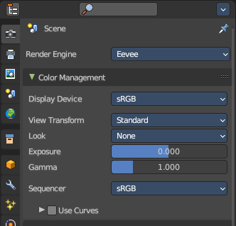
Display the image with using the color management settings. The color management can be adjusted in the properties editor in the Render tab.
Seam Margin
This option belongs to the UV Editor, and has no effect in the Image editor. Take a margin into account when fixing UV seams during painting.
Source Type Generated
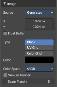
X / Y
The image width and height.
Float Buffer
Use a floating point buffer. 8 Bit images uses integers. 32 Bit works with floats.
Generated Type Blank
This type displays an image with one blank color
Color
The color of the blank image.
Generated Type UV Grid
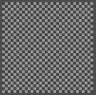
This type displays a with a black and white checker texture but colored dots.
Generated Type Color Grid
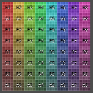
This type displays a with a colored checker texture with numbers.
Color Space
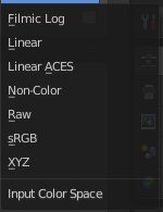
Choose the color space type for the image.
Half Float Precision
Just with image material that uses 32 bit float. Use just 16 Bit per channel instead of the full 32 bit. This lowers the memory usage while rendering.
View as Render
Display the image with using the color management settings. The color management can be adjusted in the properties editor in the Render tab.
Seam Margin
This option belongs to the UV Editor, and has no effect in the Image editor. Take a margin into account when fixing UV seams during painting.
Source Type Udim
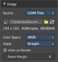
UDIM is an enhancement to the UV mapping and texturing workflow. And does not belong here. But in the UV Editor. It is just in the list because it shares the same menus with the UV Editor.
Info string
Some information about the currently loaded image. Resolution and color space.
Color Space
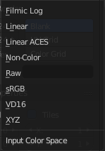
Choose the color space type for the movie or image sequence files.
Alpha
Choose the alpha channel mode. Straight or Premultiplied.
Half Float Precision
Just with color space sRGB. Use just 16 Bit per channel instead of the full 32 bit. This lowers the memory usage while rendering.
View as Render
Display the image with using the color management settings. The color management can be adjusted in the properties editor in the Render tab.
Seam Margin
This option belongs to the UV Editor, and has no effect in the Image editor. Take a margin into account when fixing UV seams during painting.
Node Tab - Properties Panel with File Output node
Directory
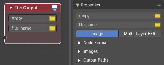
The directory to save to.
| Entry | What it does |
|---|---|
| File Name | The file name to save with. |
| Type of media to save | Image: Save as image. · Multi-layer EXR: Save as multi-layer EXR file. |
Node Format subpanel
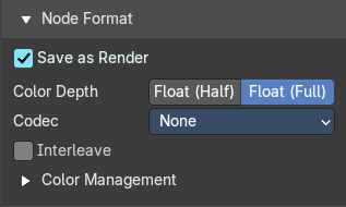
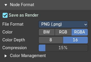
Export settings for the different image file formats and the Exr file. These are already described in the Properties > Output chapter. So we won’t repeat it here.
Layers subpanel
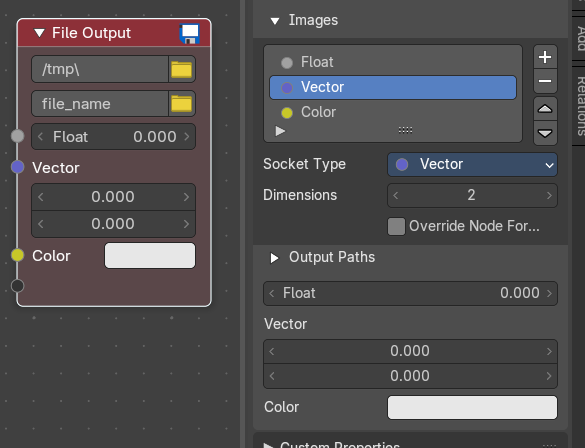
Allows you to define input sockets for the File Output node.
Socket Type
The socket type.
Dimensions (Vector type)
How many values the vector has.
Override Node Format
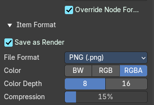
Use a different format instead of the node format for this file. Ticking it opens yet another file format picker.
Output Paths subpanel
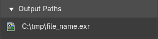
Just EXR
Shows the path to the saved file.
Node Tab - Properties Panel with Movie Clip node
File property
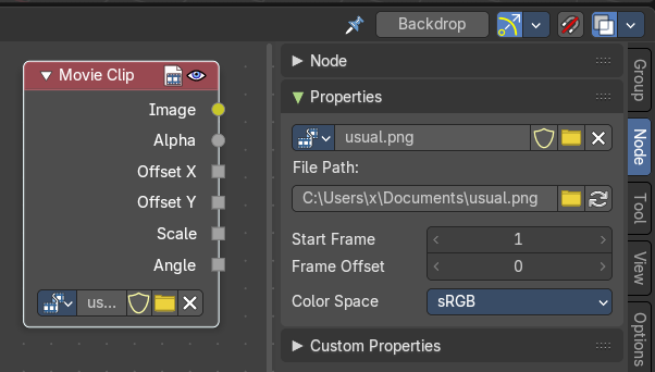
| Entry | What it does |
|---|---|
| File browser | Browse the available movie clips. |
| File name | The name of the current active movie clip. |
| Fake User | How many users this clip has. |
| Remove | Remove the current active clip. |
| Entry | What it does |
|---|---|
| File Path | The file path to the active movie clip. · Browse: Browse for another file. · Refresh: Refresh the file. |
| Start Frame | The start frame at which the movie starts playing. |
| Frame Offset | Offset of footage first frame relative to its file name. |
Color Space
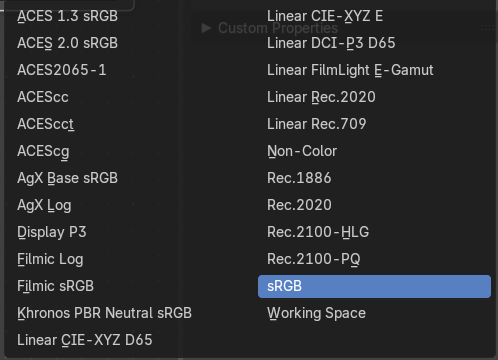
Choose the color space for the imported movie.
Tool Tab
Tool Tab
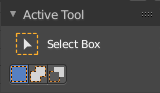
The settings of the currently active tool in the tool shelf.
In the node editor we don't have something special here. The tool related settings are explained in the tool shelf chapter.
View Tab
View Tab - Backdrop Panel
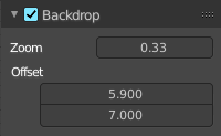
When you add and connect a Viewer node, then you can display the result as a backdrop in the node editor viewport. Here you can find some further Backdrop settings.
| Entry | What it does |
|---|---|
| Backdrop checkbox | Turn on or off the display of the backdrop image. |
| Zoom | The zoom factor of the image. A value of 1 displays the image in original size. |
| Offset | The position of the image in the viewport. |
View Tab - Annotation Panel
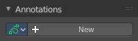
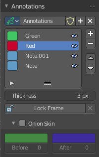
View related settings. Which is in the node editor just the Annotations panel where you can manage the Annotation layers and materials.
When you don't have drawn an annotation yet then the panel just contains a New button.
Annotations prop
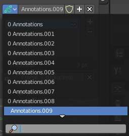
Add, remove and rename new annotations.
Drop down box
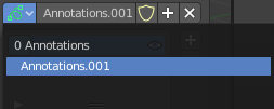
A list of the available annotation layers.
| Entry | What it does |
|---|---|
| Edit Box | The name of the current annotation. You can rename the annotation to your needs here. |
| Fake User | Assign a fake user to this annotation. Fake users is an odd concept to keep data in the scene even if it has no user somewhere. The fake user is then a dummy user so that the object is not deleted when saving the scene. |
| Add Annotation | Add a new annotation. |
| Delete Annotation | Delete the annotation. |
List of Annotation Strokes

Here you see your Annotation layers for the current Annotation. Every layer can have an own color.
At the right side you find buttons to sort them and to add and remove new Annotation layers.
You can change the color by clicking at the color field. A color dialog will pop up. You can rename annotation layers by double clicking at it.
The eye icon allows you to make it invisible And it has a search field.
| Entry | What it does |
|---|---|
| Thickness | The thickness of the annotation stroke. |
| Frame Locked/Unlocked | Lock frame displayed by current layer. This toggles whether the active layer is the only one that can be edited. |
Onion Skin
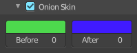
Enable Onion Skinning.
Onion Skinning allows to show ghosts of the keyframes before and after the current frame. In this sub panel you can adjust the color of the onion skin frames.
With the numbers below the colors you can define how many frames before or after are displayed that way.
Options Tab
Options Tab - Performance panel
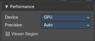
In the Options tab you will find general options for performance. The Performance panel provides you with settings that improves the performance and how the compositor renders. Here you can get faster results.
Device
The hardware device used to render the image.
CPU
Uses the CPU to calculate.
GPU
Uses the GPU to calculate, which uses parallel processing for near real time results.
Precision
The quality and precision of the compositor intermediate results when editing the image.
Auto
Automatically optimizes the precision dynamically.
Full
Final quality precision.
Viewer Region
Use boundaries for viewer nodes and composite backdrop.
Add Tab
Add Tab
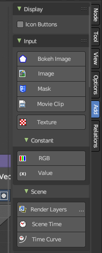
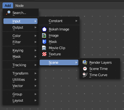
Here you can find the same nodes than in the Add menu. Panels are more convenient to use. They stay open for example. It's your decision with what system you want to work.
We won't explain the content of the panels again. The single nodes are explained in the add menu chapter.
Usage
Click at one of the node buttons, then move the mouse into the viewport. The created node sticks at the mouse. Click again to release it.
Add tab - Display Panel
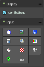
Icon Buttons
You can display the nodes in the panels either as text buttons or as pure icon buttons.
Relations Tab
Relations tab - Display Panel
Icon Buttons
You can display the nodes in the panels either as text buttons or as pure icon buttons.
Relations tab - Group Panel
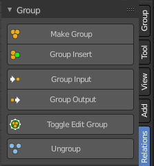
Node groups allows you to group different nodes of the material together to reduce the visual complexity. A node group acts like any other node.
Material node groups should not include Input nodes, like Image nodes, or Output nodes.
If you include a source node in your group, you will end up having the source node appearing twice: once inside the group, and once outside the group in the new material node tree.
If you include an output node in the group, there will not be an output socket available from the group!
Make Group
Groups the selected nodes together.
Select the nodes that you want to group together. Choose Make Group. You will now see a green background. This indicates that the group is created, and that you are in edit mode for the group now.
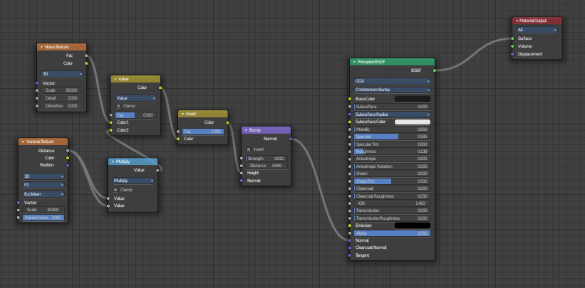
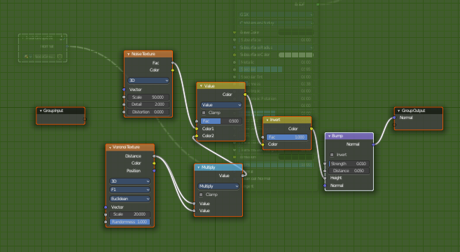
To exit the group edit mode press Tab key, or choose Toggle Edit Group menu item . That way you can also enter the Group Edit mode again.
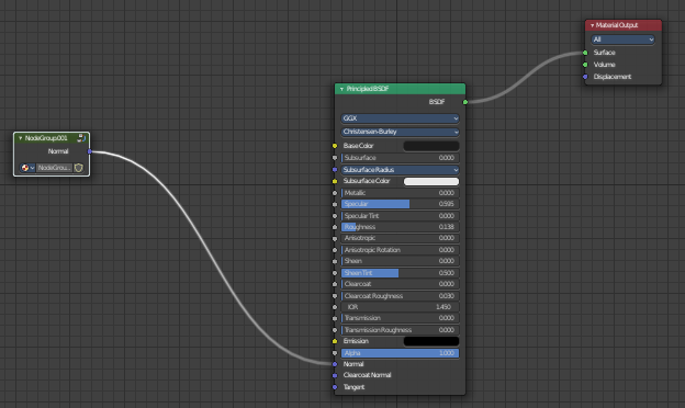
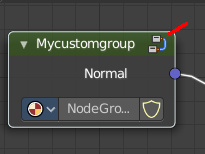
There is a third way to enter the group edit mode. Click at the right upper icon of the group node.
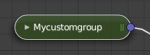
A group can be further collapsed by clicking at the triangle button in the upper left corner.
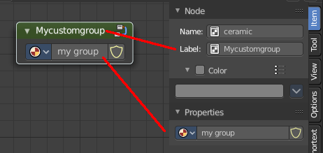
The group can be renamed in the sidebar in the Item tab and in the Properties tab in the Node panel.
Group Insert
Inserts the selected node into the selected group.
Usage
Select the node.
Hold down shift, and select the group.
Click the Group Insert button. The node will now be part of the group, and you will land in group edit mode. Press tab to exit the group edit mode.
Group Input
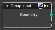
Adds a group input node.
Note: When at a top level, this node is unavailable. These are only available when inside a node group.
Group Output
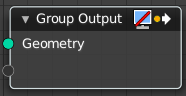
Adds a group output node.
Note: When at a top level, this node is unavailable. These are only available when inside a node group.
| Entry | What it does |
|---|---|
| Toggle Edit Group | Enter or exit the edit group mode. |
| Ungroup | Ungroups an existing group. You need to be outside of the group edit mode. |
Relations tab - Node Group Panel
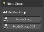
When you create a node group, then this node group is listed here. And can be dragged from there for reuse too.
Relations tab - Layout Panel
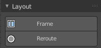
These nodes helps organizing the node layout.
Frame
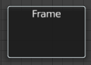
The Frame node allows you to drop nodes into a frame. This frame can be dragged around as a whole.
Adding and Removing Nodes
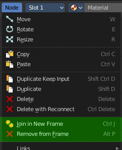
Nodes can be added by simply dropping them onto the frame. Or with the Join in New Frame menu item in the Node menu.
To remove a node from the frame use Remove from Frame.
Resizing Frame
When the Frame node is first placed in the node editor workspace you can resize it by dragging one of the edges.
Once a node is placed in the Frame, the Frame shrinks around the nodes. You cannot resize it anymore with handlers. Just by dragging around the nodes inside of the frame.
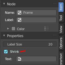
This behavior can be changed by disabling the Shrink option in the Item tab in the Properties panel. Then you can resize the frame again by dragging the edges.
Label and Color
You can change the name of a frame in the Node panel. And you can give it a custom color by checking the Color checkbox and adjusting the color then.
Reroute
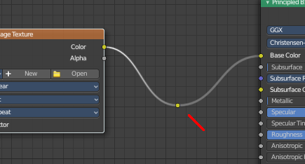
Adds a reroute point that can be used to reroute connections. It allows just one input, but allows multiple output connections.
To quickly add a Reroute node into an existing connection, hold Shift and Right Mouse and drag the mouse to cut through the link. A new reroute node will be added.
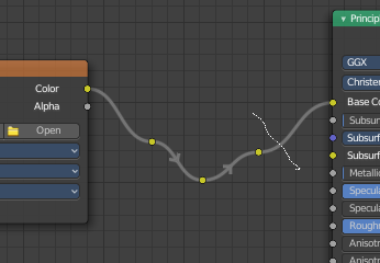
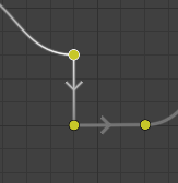
When you exceed a specific angle amount between the reroute nodes, then the node connection becomes a sharp corner, and not longer a Bezier like soft curve.
Move, Rotate, Scale
A normal node has a handler. The reroute dot not. You can't simply move it around with the mouse by clicking at the top area. It has none. You have to use the move, rotate and scale commands. They can be found in the View menu.
Group Tab
Group tab - Introduction
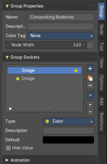
The Compositor sidebar Group tab at the right side contains options and settings for node groups and socket input and output properties.
Group Properties Panel
Name
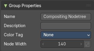
Change the name of the current node group. Type in a new name and hit enter.
Description
Change the description of the current node group. Type in a new name and hit enter.
Color Tag
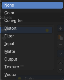
Changes the header color of the current node group.
Node Width
The width for newly created group nodes.
Group Sockets Panel
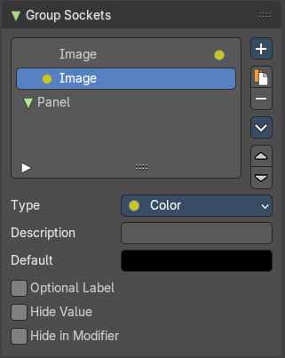
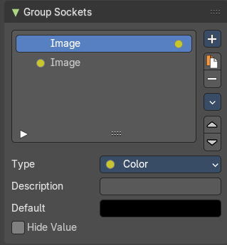
Manage the input and output properties of the Group Input and Output nodes.
More than one input and output slot can be useful when you want to modify compositor sockets in the node group in more than one way.
Group Socket List
List of available input and output sockets.
Note: The list can be sorted by dragging the items around.
List
The list of input and output sockets.
| Entry | What it does |
|---|---|
| Socket Name | Change the name of the current selected input socket by double clicking on the socket in the list. Type in a new name and hit enter. |
| Searchbar | Clicking at the white arrow button down left of the list will reveal a search input box. |
| Resize Handle | The list can be resized by pulling at the resize handle in the center of the list at the bottom. |
New Item
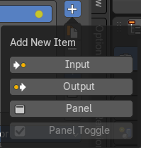
Adds a new input sockets to the list.
| Entry | What it does |
|---|---|
| Input | Adds a new input sockets to the list. |
| Output | Adds a new output socket to the list. |
| Panel | Adds a new panel socket to the list. |
Panel Toggle
When you create a panel, then the panel toggle button becomes active. By default the checkbox is ticked. And all available panel toggles are on. When you untick it then you reveal a Panel Toggle subpanel, where you have more fine control over the toggles.
Panel toggle subpanel
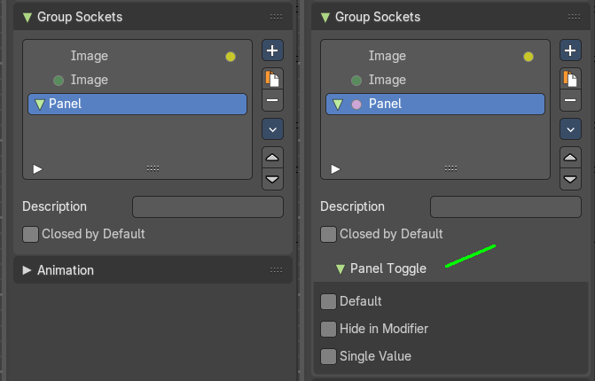
| Entry | What it does |
|---|---|
| Default | Input value for unconnected socket. |
| Hide in Modifier | Don’t show the modifier in the geometry nodes modifier interface. |
| Single Value | Only allow single value input rather than field. |
| Entry | What it does |
|---|---|
 Duplicate Item | Duplicates the active socket. |
 Remove Item | Removes the selected input socket from the list. |
Move Item Up/Down

Moves the active item to the specified direction. You can move the active item up or down the list.
Note: You can also alternatively drag and drop the active item to re-order.
Inputs
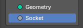
Inputs are characterized by the colored dot to the left. These are manifested in the Group Input node.
Outputs
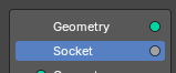
Outputs are characterized by the colored dot to the right. These are manifested in the Group Output node.
Type
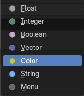
What kind of node group input or output type it is.
Type Float
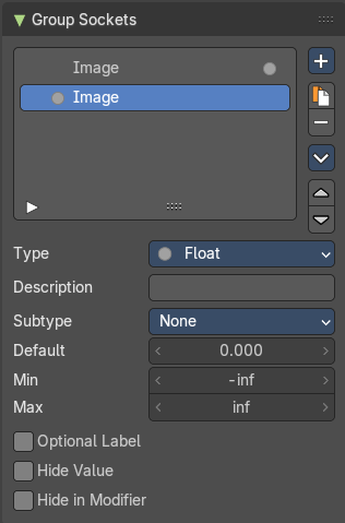
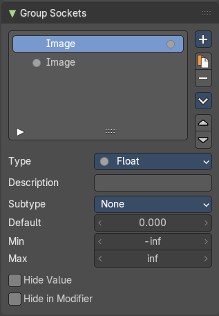
Description
Add a tooltip to the socket description.
Subtype
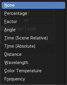
What special math operation is required. The subtype menu allows you to define the socket type sliders and read-out.
| Entry | What it does |
|---|---|
| Default | The default value for the socket. |
| Min | The minimum value for the socket. Note: This is only available for vector and float types. |
| Max | The maximum value for the socket. Note: This is only available for vector and float types. |
| Optional Label | This label is not necessary to understand its meaning. |
| Hide Value | Hide the input value even when the socket is not connected. |
| Hide in Modifier | Don’t show the input value in the geometry nodes modifier interface. |
Type Integer
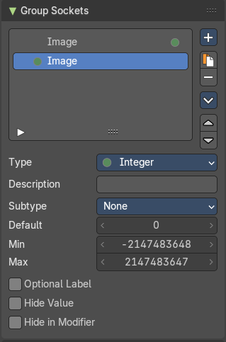
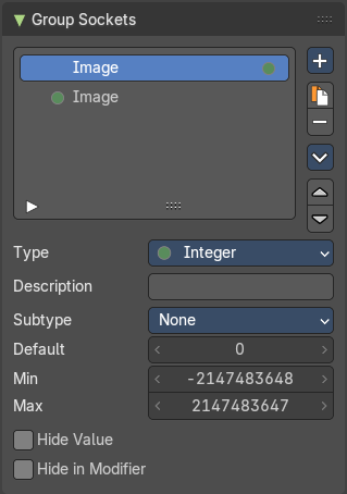
Description
Add a tooltip to the socket description.
Subtype
What special math operation is required. The subtype menu allows you to define the socket type sliders and read-out.
| Entry | What it does |
|---|---|
| Default | The default value for the socket. |
| Min | The minimum value for the socket. Note: This is only available for vector and float types. |
| Max | The maximum value for the socket. Note: This is only available for vector and float types. |
| Optional Label | This label is not necessary to understand its meaning. |
| Hide Value | Hide the input value even when the socket is not connected. |
| Hide in Modifier | Don’t show the input value in the geometry nodes modifier interface. |
Type Boolean
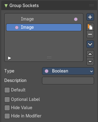
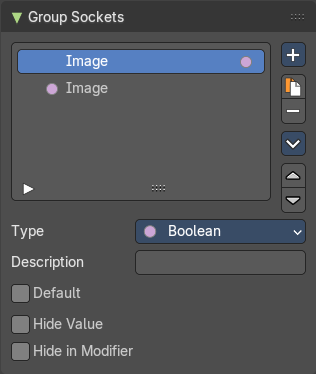
| Entry | What it does |
|---|---|
| Description | Add a tooltip to the socket description. |
| Default | The default value for the socket. |
| Optional Label | This label is not necessary to understand its meaning. |
| Hide Value | Hide the input value even when the socket is not connected. |
| Hide in Modifier | Don’t show the input value in the geometry nodes modifier interface. |
Type Vector
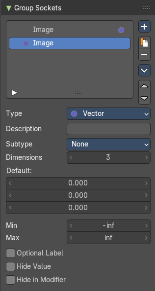
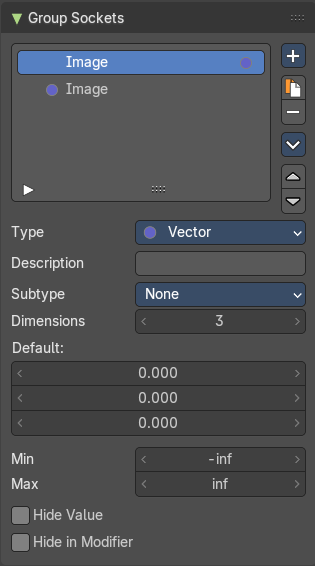
Description
Add a tooltip to the socket description.
Subtype
What special math operation is required. The subtype menu allows you to define the socket type sliders and read-out.
| Entry | What it does |
|---|---|
| Dimensions | How much dimensions to calculate. |
| Default | The default vector. It changes, dependant of what dimensions you use. |
| Min / Max | Minimum value and maximum value. |
| Optional Label | This label is not necessary to understand its meaning. |
| Hide Value | Hide the input value even when the socket is not connected. |
| Hide in Modifier | Don’t show the input value in the geometry nodes modifier interface. |
Type Color
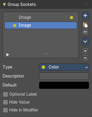
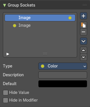
| Entry | What it does |
|---|---|
| Description | Add a tooltip to the socket description. |
| Default | The default color for the socket. |
| Optional Label | This label is not necessary to understand its meaning. |
| Hide Value | Hide the input value even when the socket is not connected. |
| Hide in Modifier | Don’t show the input value in the geometry nodes modifier interface. |
Type String
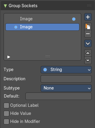
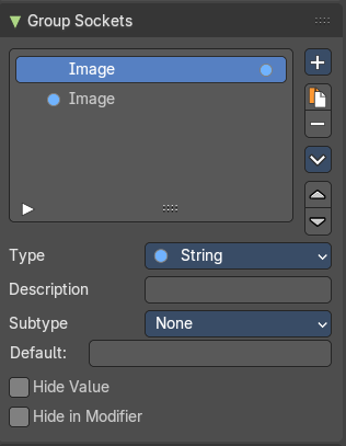
Description
Add a tooltip to the socket description.
Subtype
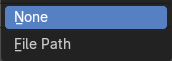
What special math operation is required. The subtype menu allows you to define the socket type sliders and read-out.
| Entry | What it does |
|---|---|
| Default | The default string. |
| Optional Label | This label is not necessary to understand its meaning. |
| Hide Value | Hide the input value even when the socket is not connected. |
| Hide in Modifier | Don’t show the input value in the geometry nodes modifier interface. |
Type Menu
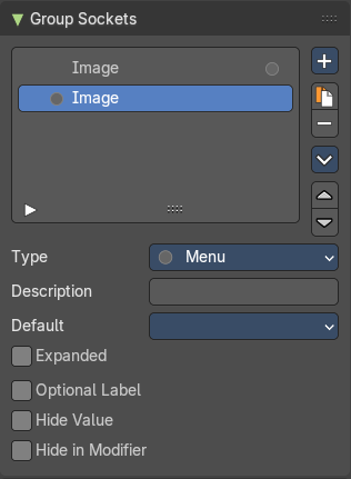
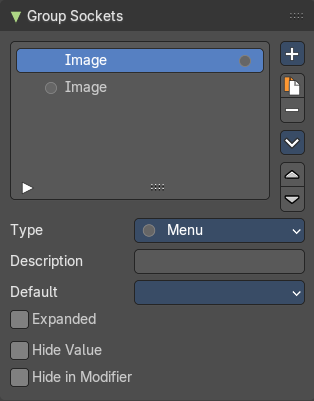
| Entry | What it does |
|---|---|
| Description | Add a tooltip to the socket description. |
| Default | The default menu. |
| Expanded | Draw the menu socket as an expanded drop down menu. |
| Optional Label | This label is not necessary to understand its meaning. |
| Hide Value | Hide the input value even when the socket is not connected. |
| Hide in Modifier | Don’t show the input value in the geometry nodes modifier interface. |
Group Sockets Panel - Type Panel
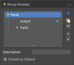
TODO
Closed by default
Panel is closed by default on new nodes.
Panel Toggle
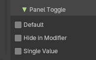
Note: The Panel Toggle properties are only for the Panel Boolean type of panels.
| Entry | What it does |
|---|---|
| Default | The default value for the boolean toggles. |
| Hide in Modifier | Hides the panel boolean toggle from the modifier stack. |
| Single Value | The default value for the panel boolean toggle. |
Animation Panel
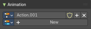
Animation panels are about the Animation Slots for scene wide animation clips.
| Entry | What it does |
|---|---|
| New | Create a new action clip for the light, used in the Dopesheet Editor - Action Clip mode. |
| Action Selector | This selector allows users to manage actions associated with a particle system, ensuring that the correct animation data is applied. · Fake User: Assigns a "fake user" to the action, preventing it from being automatically deleted when it is no longer in use. · Add: Make a copy of the current action, including all animation data. · Remove: Delete the selected action, removing it from the light source. |