












































Header
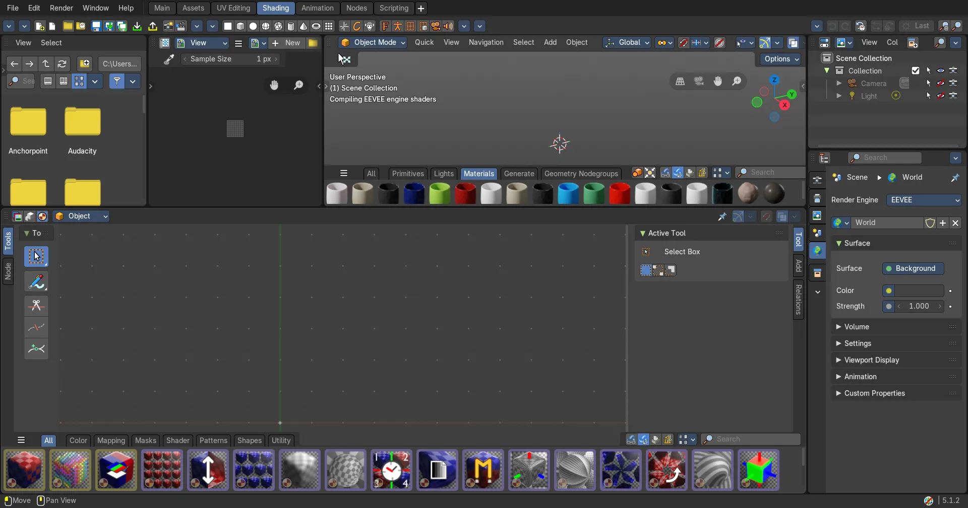
The Header contains various menus, navigation elements, settings and tools for the viewport.
Compositor Editor - Header
The Header contains various menus, navigation elements, settings and tools for the viewport. The content of the menus may differ, dependent of the chosen renderer.
The header is divided into three areas. Left menus and modes. Centered is the compositing nodetree. Right settings.

Header Tabs

The tabs at the very left allows you to switch between the most important node editor types by one click. Compositor Editor, Geometry Nodes Editor and Shader Editor.
Header Modes
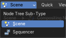
The compositor comes in two modes. You can either work at compositing for a rendered image. The scenes. Or do compositing for the sequencer. Animations.
The nodes and the compositing are the same. Just the input source is different.
Header right click menus
The general right click menu functionality is explained in chapter 6 Editors introduction.
Editortype Menu
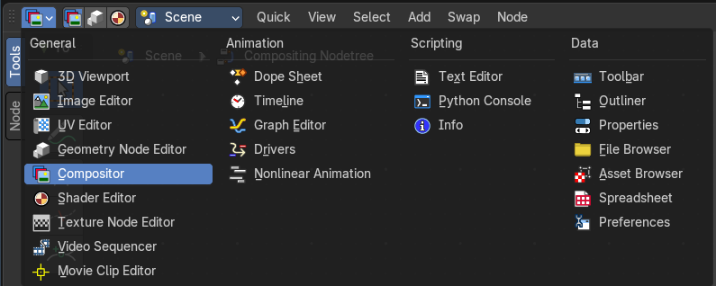
Bforartists is made of several editor types. Headers can display a menu where you can switch to other editor types.
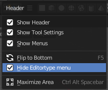
This menu is hidden by default. It is meant to edit the layouts, and should not be necessary for regular work. You can reveal it in the header right click menu.
Tools and Options
Nodetree property

Manage the compositing nodetrees.
Nodetree list
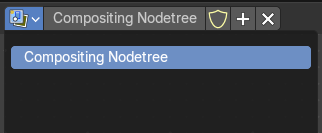
The list of the available nodetrees.
| Entry | What it does |
|---|---|
| Nodetree name | The name of the active nodetree. |
| Fake User | Protect this nodetree to be removed when it has no user. |
| New compositing node group | Generate a new compositing node group. |
| Remove | Remove the active compositing node group. |
Options

At the right side of the header you will see the options.
| Entry | What it does |
|---|---|
| Pin (pin icon) | The pin button will keep the current material selection fixed. When a material is pinned, it will remain visible in the shader editor even when another object or material is selected elsewhere. |
| Parent Node Tree | Grouping nodes can simplify a node tree by allowing instancing and hiding parts of the tree. Both material and composite nodes can be grouped. This button becomes active when you work with such grouped nodes, and you are in a child group. it allows you to switch to the parent group. |
Backdrop


By adding a viewer node you can display the compositing result as a background in the viewport. Here you can activate it, and adjust the look. It also contains controls to adjust the zoom and position of the backdrop image.
| Entry | What it does |
|---|---|
| Background Image Move | Move the background image. A click confirms. Watch the hotkey. |
| Background Image Zoom in and out | Zoom in and out the Background image. |
| Background Image Fit | Fits the background image into the view. |
| Display channels | What channels to display in the backdrop. |
Viewport Gizmos
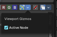
Toggles showing node editor gizmos.
Active Node
Shows the active node gizmo, specifically for the Split viewer node.
Snap
Activates snapping.
Node Editor Overlays
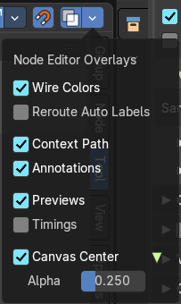
Activates the node editor overlays. When the tool is activated, then you will also overlays settings in the editor. The drop down arrow to the right shows different overlay types.
Show Overlays
Show or hide the overlays.
Wire Colors
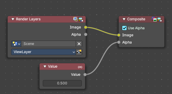
Color node links based on their connected sockets.
Example: The color Image socket is yellow that makes a yellow line, and the Value socket is grey that makes a grey line.
Reroute Auto Labels
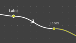
Label reroute nodes based on the label of connected reroute nodes.
Example: The first reroute label to the right has concurring reroute labels down the line. If you toggle this off, the concurring reroute labels down the line won’t contain labels.
Context Path
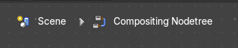
Display breadcrumbs for the editor’s context up left.
| Entry | What it does |
|---|---|
| Annotation | Shows annotations for this editor view that have been drawn by the annotation tool. |
| Previews | Shows each nodes preview thumbnails if the node has previews toggled on. |
| Timings | Shows a timing box above each node to indicate the evaluation time of it.. This option is only available for compositing and geometry nodes. |
| Canvas Center | Display the canvas center. · Alpha: How transparent the green and red canvas center lines are displayed |
Quick Menu
Quick Menu
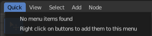
The quick menu, or in long Quick Favorites menu, is a menu that can be customized to your needs. Here you can add operators for quick access.
It is located in the header. But it can be called by hotkey Q directly under the mouse. This hotkey works in other editors too.
When the menu is empty, then you will see the message "No Menu Items found". This means that you first have to add some tools to the menu. It is a user configurable menu.
Note that added operators in this menu does not have icons. Just text.
Adding an operator to the Quick menu
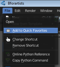
Open the panel or the menu where your operator is that you want to add.
Let's add the open command from the File menu. Open the File menu, right click at open, and choose Add to Quick Favorites.
Do the same with Save As. We should now have two new menu items in the Quick menu, which you can use now.
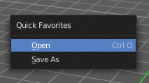
As a rule of thumb, when the right click menu has an Add to Quick Favorites, then you can add it to the quick menu.
Note that you can also add operators from the tool shelf at the left. And also operators from other editor types. Some other editors have their own quick menu though. The Image Editor for example. These operators gets added in the quick menu of the image editor then. And does not show in the quick menu in the header of the 3D view.
Adding a menu to the Quick menu
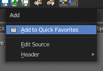
It is also possible to add a menu to the Quick menu. For example the whole Add menu. The way is the same. Right click at it, and choose Add to Quick Favorites.
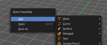
Order
You might notice that the add menu adds at the top of the menu, and not at the bottom as you would expect. First comes menus, then comes operators. And they get added in the order in which you add them.
Besides that, operators and menus gets added in the order that you add them. They cannot be sorted afterwards. So be careful how you add them. You can of course always remove operators and menus, and re-add them at the end of the list.
Removing an operator from the Quick menu
The Quick Favorites menu (Q) holds the tools and menus you add to it yourself. See Quick Favorites in the Interface chapter.
Context and mode dependent content
The quick favorites. menu exists in nearly all editors. But it is just in the 3D view available in the header. So that you know this functionality exists. In the other editors you call it with hotkey Q.
The content of the quick favorites. menu changes, dependent over which editor you are, and in what mode you are. When you add for example an operator from the image editor, then this operator just shows in the quick menu when you call the menu from the image editor. Same goes for the modes. Edit mode tools will just show in edit mode. And so on.
View Menu
View Menu
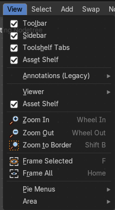
The View menu contains all View related tools.
The content is the same in all sub modes.
Toolbar
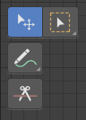
Shows or hides the toolbar at the left.
Sidebar
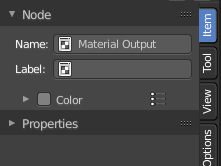
Shows or hides the sidebar at the right in the viewport.
Asset Shelf
Shows or hides the Asset Shelf to the bottom of the Shader Editor.
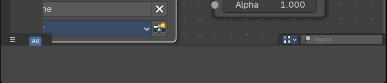
Annotations (Legacy)
This group of operators is useful to take notes without changing tool-shelf operators. These notes can be colored in the View tab of the Property Shelf. Each layer is a single color. You can also animate the notes with keyframes, editable in the dopesheet.
Note: These are legacy operators, meaning they are equally available in the Toolshelf as a modal operator.
| Entry | What it does |
|---|---|
| Draw Annotation | Starts the annotation free hand draw tool in the editor. |
| Draw Line Annotation | Starts the annotation line draw tool to draw straight lines in the editor. |
| Draw Polyline Annotation | Starts the annotation Polyline draw tool in the editor which allows to draw multiple connected straight lines in the editor. |
| Erase Annotation | Starts the annotation erase tool in the editor which erases any strokes in the editor. |
| Add Annotation Layer | Starts a new annotation layer. |
| Erase Annotation Active Keyframe | Erases the active keyframe of the annotation. |
Viewer
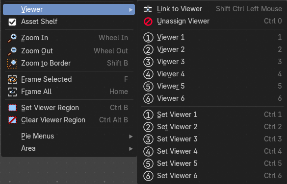
The viewer contains a series of quick actions to link a node to a viewer to preview compositor results.
| Entry | What it does |
|---|---|
| Link to Viewer | Creates a temporary connection to the Viewer Node, allowing to quickly preview the output of any node within the compositor by clicking on it. Note: This operator only works under the mouse cursor and is shown in this menu for discoverability purposes only. |
| Unassign Viewer | Removes any quick number assignment linked to a Viewer, allowing it to revert to an unassigned state. |
| Viewer 1-6 | Activates a viewer that has been assigned a quick number. When you press a number from the keyboard numbers row, it will toggle the Viewer in the Image Preview Editor. |
| Set Viewer 1-6 | Sets a viewer to a quick number assigment. When you assign a number, you can use the numbers row on the keyboard to toggle the Viewer for the Image Preview Editor. |
Zoom In
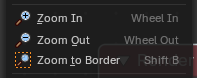
Zooms into the viewport.
| Entry | What it does |
|---|---|
| Zoom Out | Zooms out of the viewport. |
| Zoom Border | Draws a rectangle and zooms then to fit the size of this rectangle. Zooming in is done with drawing the rectangle with left mouse button. Zooming out is done with drawing the rectangle with middle mouse button. |
| Frame Selected | Zooms to the selection. |
| Frame All | View all zooms in or out in the viewport until all objects in the scene are displayed fitting in the viewport. |
Pie menus

Lists the available pie menus, and gives you the ability to read the hotkeys and assign own hotkeys.
Area
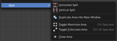
This menu contains general view functionality. And exists in most other editor types too.
| Entry | What it does |
|---|---|
| Horizontal Split | Splits the current view horizontally into two independent editor windows. |
| Vertical Split | Splits the current view vertically into two independent editor windows. |
Duplicate Area into New Window
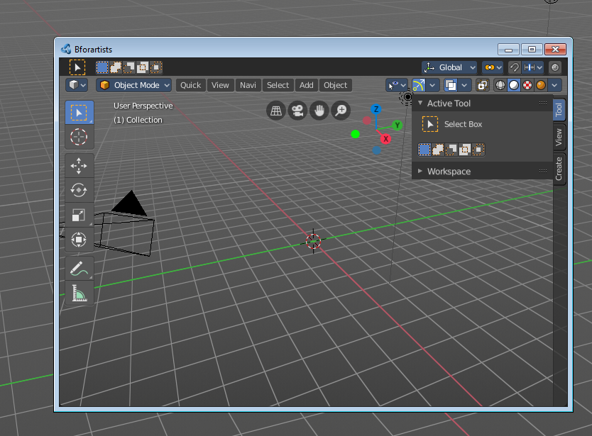
Duplicate Area into New Window opens this editor in a floating window. See Floating editor windows in the Interface chapter.
| Entry | What it does |
|---|---|
| Toggle Maximize Area | Displays the editor maximized with menus. To return from the maximized view press hotkey Ctrl + Space. Or reuse the menu item in the area menu. |
| Toggle Full screen Area | Displays the editor maximized without menus. To return from the full screen view press hotkey Ctrl + Alt + Space. |
| Close Area | Closes the editor. |
View Menu with Backdrop
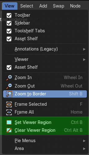
When you activate the Backdrop in the header, then the View menu reveals some more functionality.
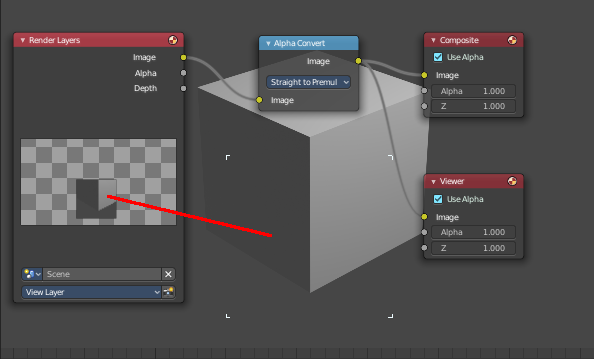
| Entry | What it does |
|---|---|
| Set Viewer Region | Allows you to define an area of the Backdrop. Then just this are gets processed. |
| Clear Viewer Region | Removes the Viewer Region. |
Select Menu
Select menu
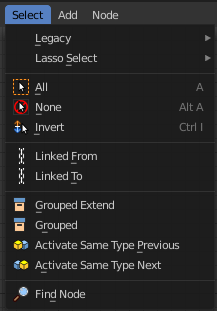
Here you will find the select functionality.
Legacy

The legacy sub menu contains tools that exists in the tool shelf already. It's the old way to do things. Different to the tools in the tool shelf, these tools are usually modal. And performs once. You have to call them again in case you want to repeat the tool.
| Entry | What it does |
|---|---|
| Box select | Draw a rectangle to select everything inside of the rectangle. It automatically adds to the current selection. Holding down shift subtracts from the selection. |
| Circle select | Brush select content. The radius of the brush can be adjusted by holding down left mouse button and using the scroll wheel or the + or - button at the numpad. It automatically adds to the current selection. Holding down shift subtracts from the selection. To exit the circle select tool click with the right mouse button. |
Lasso Select

A sub menu with the available lasso select modes.
| Entry | What it does |
|---|---|
| All | Select everything. |
| None | Select nothing. |
| Inverse | Invert the current selection. |
| Linked From | Select the nodes that are linked from the currently selected nodes. The nodes before in the hierarchy. |
| Linked To | Select the nodes that are linked to the currently selected nodes. The nodes behind in the hierarchy. |
| Grouped | Select grouped nodes. |
| Grouped Extend | Select grouped nodes, and extend from the current selection. |
| Activate same type previous | Activate same node type before the current selection, step by step. |
| Activate same type next | Activate same node type after the current selection, step by step. |
Find Node
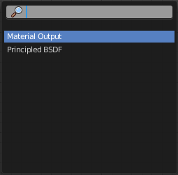
This button will open a search dialog where you can search for node types and select them in the current hierarchy.
Add Menu › Group
Add menu - Group
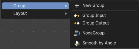
Node groups allows you to group different nodes of the ndoetree together to reduce the visual complexity. A node group acts like any other node with inputs, properties and outputs.
If you include a source node in your group, you will end up having the source node appearing twice: once inside the group, and once outside the group in the new node tree.
If you include an input/output node in the group, there will not be an input/output socket available from the group.
Note: The icons will show what state the nodegroup is in, either in a Nodegroup state (used in file), Forced User state (saved in file even if not used), Asset state (stored to the Asset Browser) or Overridden/Linked state (referenced from another file).
| Entry | What it does |
|---|---|
| Add Empty Group | Add an empty node group, with no other nodes in the node group. |
| Group Input | Adds a Group Input node. This node is usually already part of a new created group. |
| Group Output | Adds a Group Output node. This node is usually already part of a new created group. |
| Smooth by Angle | An example node group. |
List of Node Groups
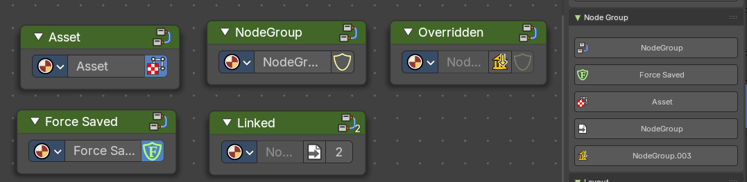
Once you have created a node group it will also show up in the Group menu.
Each nodegroup can have differing states and will show a relevant icon.
These icons and labels represent the status and behavior of node groups in your asset browser or node editor. Each state reflects how the node group is stored, linked, or overridden in your project.
- **Node Group: **A standard node group created and saved within the current file.
- Asset: This node group is marked as an Asset, meaning it's reusable across projects and stored in the Asset Browser.
- **Force Saved: **The node group has been force-saved, ensuring it persists even if unused.
- **Linked: **The node group is linked from an external file and used multiple times.
- Overridden: The node group is linked from another file but has been overridden locally.
Groups can be inserted and referenced to other node trees too. They can also be duplicated or duplicated linked. When they are duplicate linked, this means the node references the same node group multiple times.
In this chapter
- Add Menu — Every node you can add, by category: open a category for its nodes.